Since so many seem to like number 4, here's another option I cooked up using MS Paint. If I go with number 4, but somehow color-match the gold insert to be IOM (most likely I'll just paint the insert), I'd get something like this:
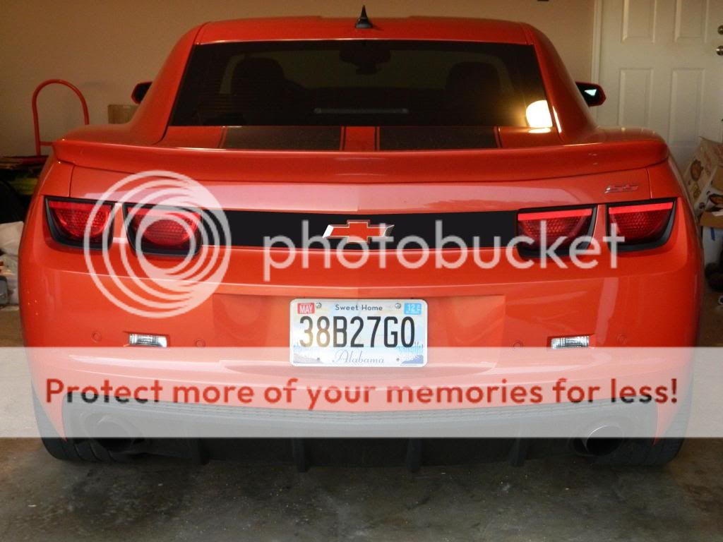
We'll call this option 5, I guess. That's just sort of jammed together with MS Paint, so it's not super realistic, I guess, but it should be pretty representative of the color scheme and basically what it would look like.
So, for everyone that preferred number 4 before, how about a choice between #4 and the new #5? Would it look better or worse with an IOM center to the bowtie?
For comparison, here's #4 again, so you can see them both together:
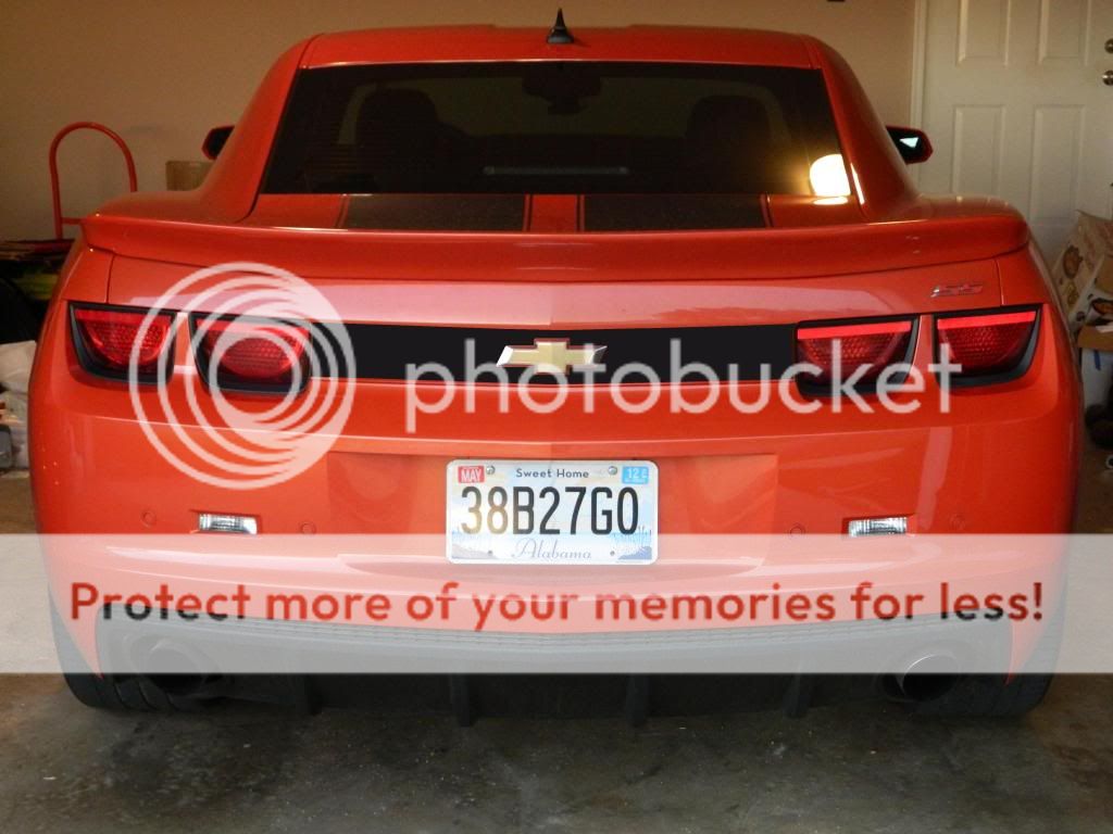
I gotta say, I think I'm kind of going with #4 over #5. I'm kind of thinking that #5 is just not enough contrast, and doesn't "pop" the same as #4.